The 200-Day Moving Average. What is it? And Why it Matters To EVERYONE.

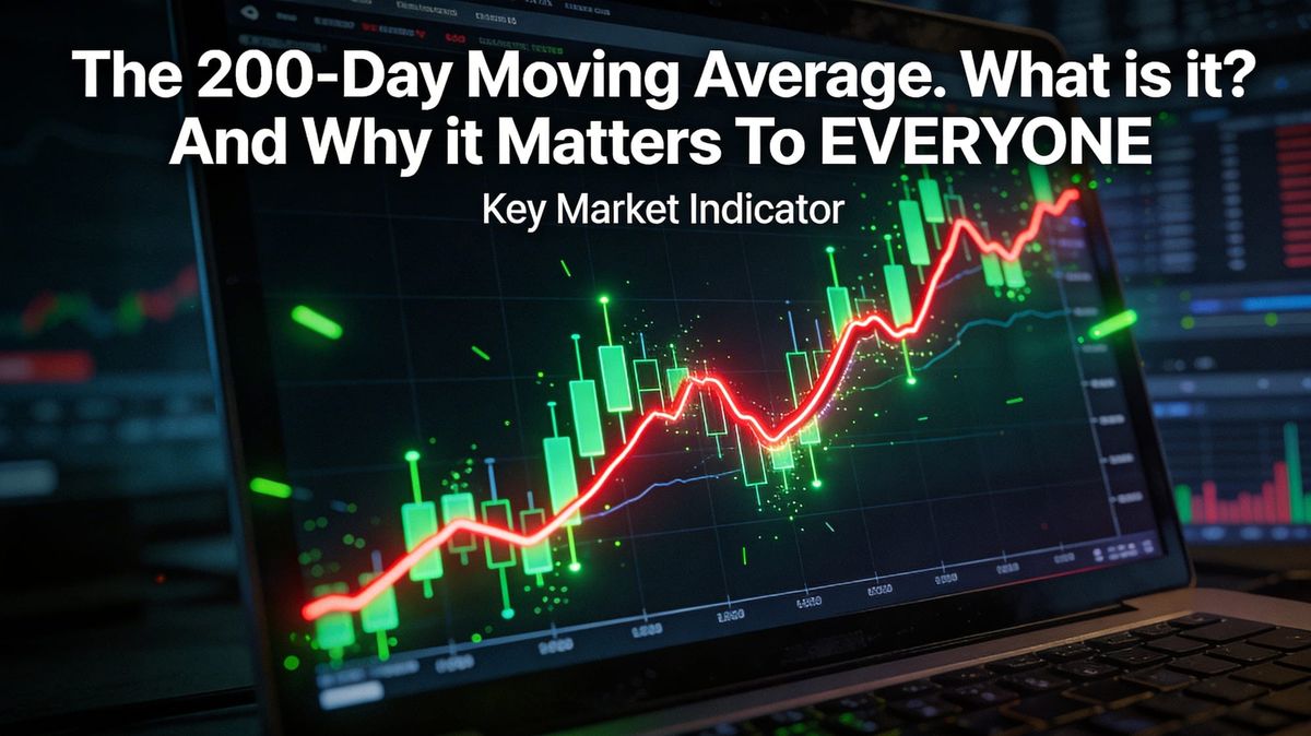
The 200-day moving average is simply the average closing price of a stock or index over the past 200 trading days. It's one line on a chart — but it's the single most-watched line in professional investing. When price is above it, the market is generally considered healthy. When price breaks below it, investors pay attention. Here's what it actually means — and what it doesn't.
If you've been following the news lately, you may have seen a phrase repeated with a kind of quiet urgency: "the S&P 500 has broken below its 200-day moving average." It gets mentioned the way a doctor might mention an elevated blood pressure reading — not a crisis, but something worth watching.
But what does it actually mean? And why do so many professional investors treat this one line as a meaningful signal rather than just another squiggle on a chart?
Let's build it from scratch.
The basics
What the Line Actually Is
A moving average is exactly what it sounds like: an average that moves. Specifically, the 200-day moving average is calculated by adding up the closing prices of the last 200 trading days and dividing by 200. Each day, the oldest price drops off and the newest one gets added. The result is a single number that tells you what the average price has been over roughly the past ten months.
Figure 1
How the 200-Day Average Is Calculated
A simplified five-day example showing how an average is built from closing prices.
In practice, the 200-day version uses 200 data points instead of 5 — but the math is identical. The result is a smooth line on a chart that irons out the daily noise and shows you the longer-term trend beneath all the short-term movement.
That smoothing is exactly what makes it useful. Day-to-day price swings can be caused by almost anything — earnings reports, news headlines, a large fund buying or selling. The 200-day average cuts through all of that and asks a simpler question: what direction has this thing been moving over the past ten months?
Why it matters
The Line That Everyone Watches
Here's the part that might surprise you: the 200-day moving average doesn't have any special mathematical magic. It's not derived from a formula about how markets work. It became important largely because so many people agreed it was important — and that agreement, over decades, made it a self-fulfilling signal.
When the price of a stock or index falls below its 200-day moving average, large institutional investors — pension funds, hedge funds, algorithmic trading systems — are programmed to treat it as a warning sign. Many of them will reduce exposure automatically. That selling pressure pushes prices down further. Other investors see the price falling and sell too. The signal becomes real through the act of believing in it.
This is why technical analysts, who study charts for a living, pay such close attention to it. And it's why you'll hear it mentioned on financial news whenever markets are under pressure.
Reading the signal
Above the Line, Below the Line — What Each Means
Figure 2
What the 200-DMA Position Signals
Two states, two different market postures. Neither is a guarantee — both are worth understanding.
The market is trading above its long-term average. Momentum is positive. Institutional investors are generally comfortable holding positions. Dips tend to attract buyers.
The market is trading below its long-term average. The trend has shifted. Risk managers at large funds reduce exposure. Rallies tend to face selling pressure. Recovery requires more evidence.
The S&P 500 broke below its 200-day moving average on March 20, 2026 — for the first time in over 200 days. That's what the headlines were referring to. It doesn't mean a crash is coming. But it does mean the technical backdrop has shifted, and that matters to the people managing large amounts of money.
The three things that can happen next
What Happens After a Break Like This
History gives us three common scenarios when a major index breaks below its 200-day moving average. None of them is certain — but knowing they exist helps you read what comes next with more clarity.
Figure 3
Three Scenarios After a 200-DMA Break
What history shows tends to happen — not what will definitely happen.
The bounce — price recovers quickly above the line
The break turns out to be a false alarm driven by temporary news. Price recovers above the 200-DMA within days or weeks. This happens often — not every break is the start of something serious.
The grind — price stays below, slowly deteriorating
The break holds. The market doesn't crash but doesn't recover either. Price drifts lower over weeks or months. This is what a prolonged correction looks like — uncomfortable but not catastrophic.
The break — price continues falling sharply
The 200-DMA break becomes the start of a larger decline. This is rarer but is how most bear markets begin. It requires additional confirmation — multiple bad economic readings, earnings deterioration, a recession signal.
Before a break, bulls have the advantage — the trend is intact and the default is to stay invested. After a break, the burden shifts. Bulls now need to prove the market can recover. That's a meaningful change in posture, even if nothing dramatic has happened yet.
The honest limits
What the 200-DMA Can't Tell You
For all its usefulness, the 200-day moving average is a lagging indicator — it tells you what has happened, not what is about to happen. By the time it signals a problem, you're already in one. And by the time it clears, the recovery may already be well underway.
It also generates false signals. Plenty of 200-DMA breaks have been followed by quick recoveries. Acting on every break mechanically — selling everything the moment price crosses below — would have cost long-term investors significant returns over time.
The right way to think about it is as a context setter, not a trigger. When the S&P 500 is above its 200-DMA, the environment is more forgiving. When it's below, more caution is warranted — not panic, just awareness. One indicator among many, not a crystal ball.
That's the honest version of what that one line on the chart actually means.